What to exaggerate and where to simplify
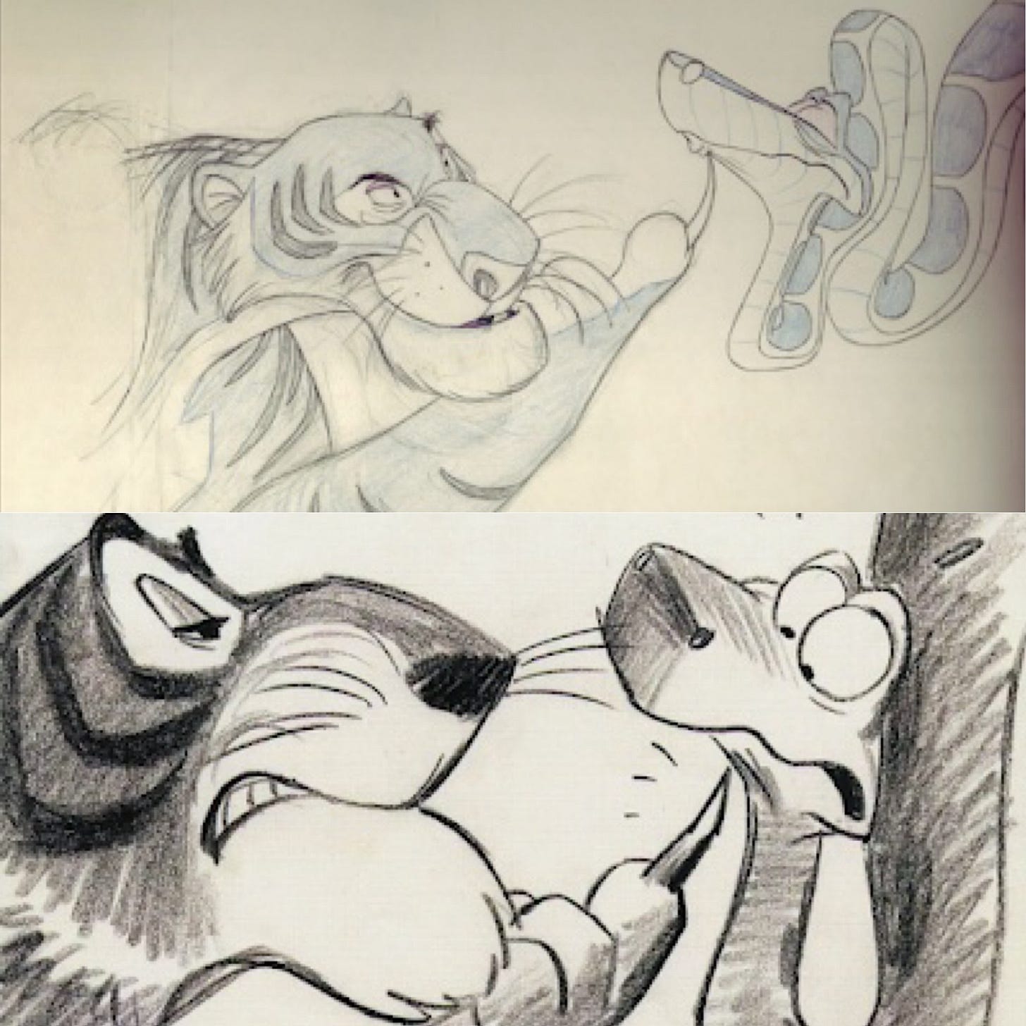
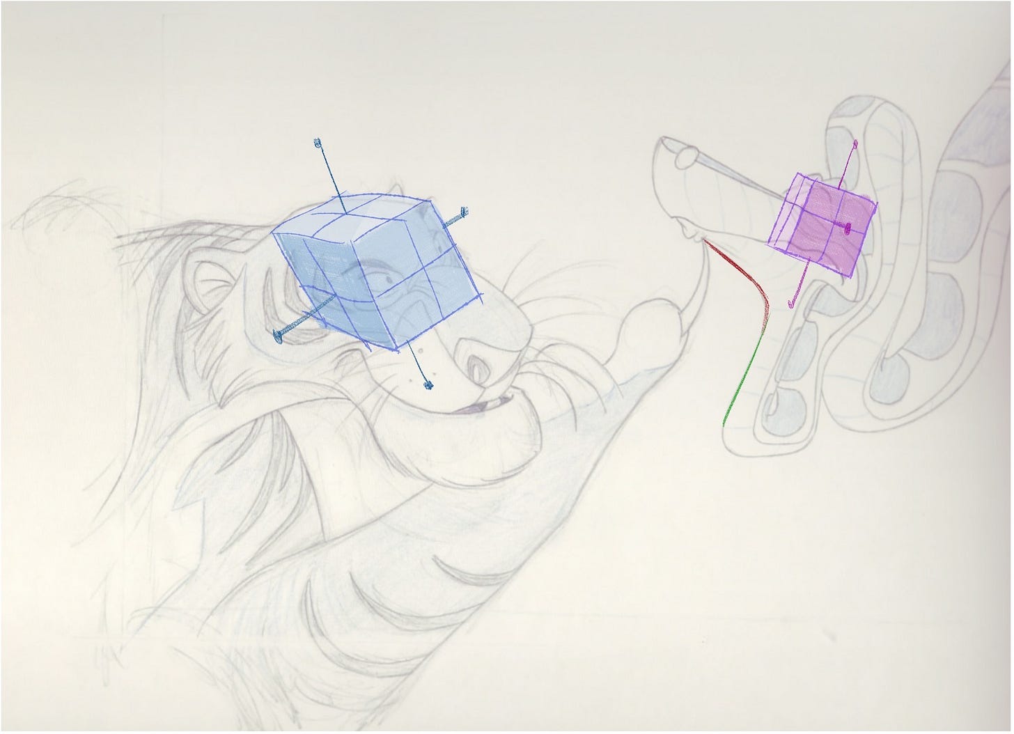
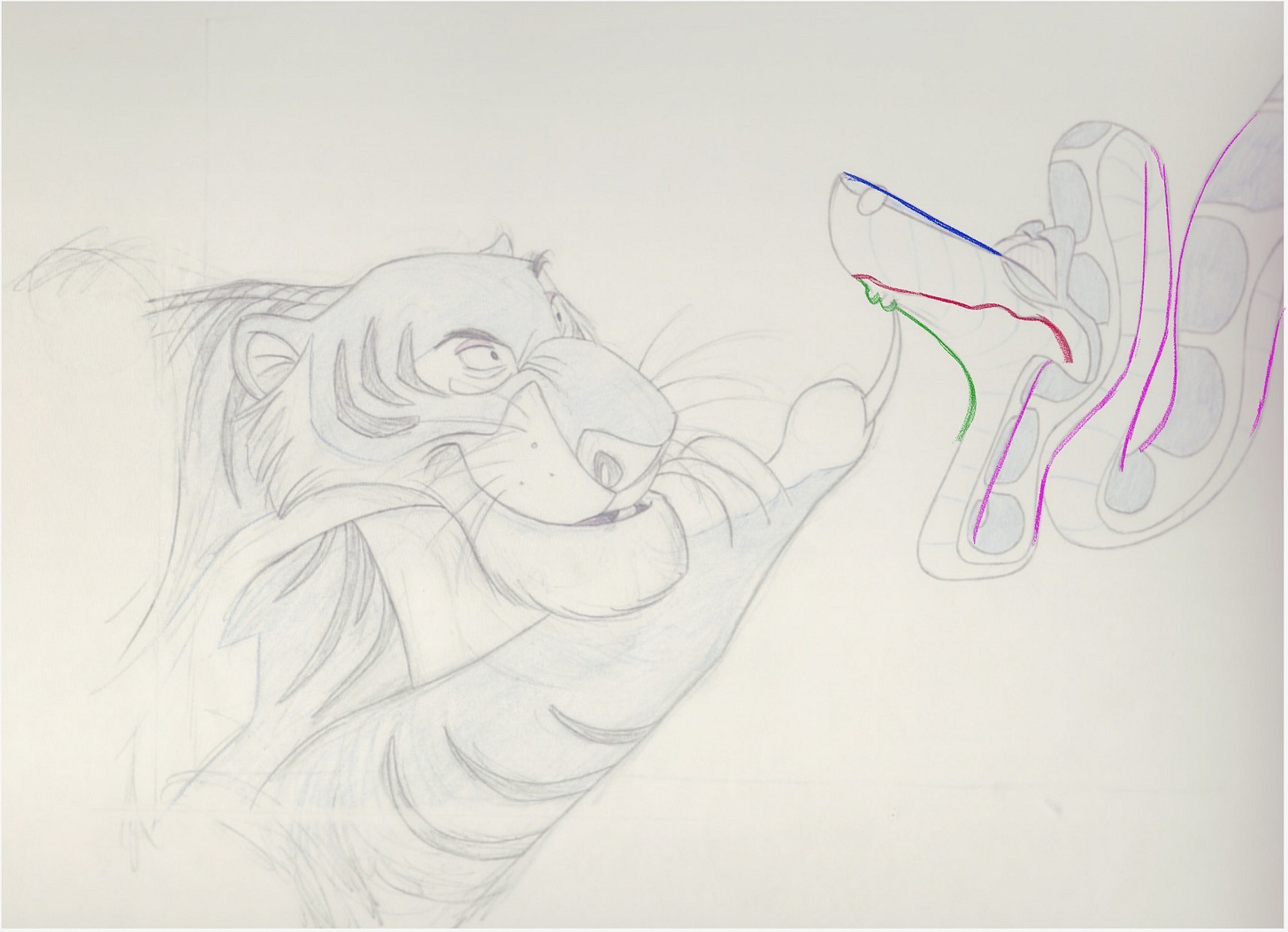
Both pictures are incredible and amazing. The first is a story sketch from Bill Peet, instrumental story person behind a lot of the classical Disney films from the golden era. The second is an animation drawing from the Maestro Milt Kahl, an exceptional showcase of being able to refine this story sketch to animation: an extraordinary ability of understanding what to exaggerate and what to simplify.
Although it's extremely difficult to build something from nothing, what I'm curious most about is Milt's ability to refine from an already appealing story sketch.
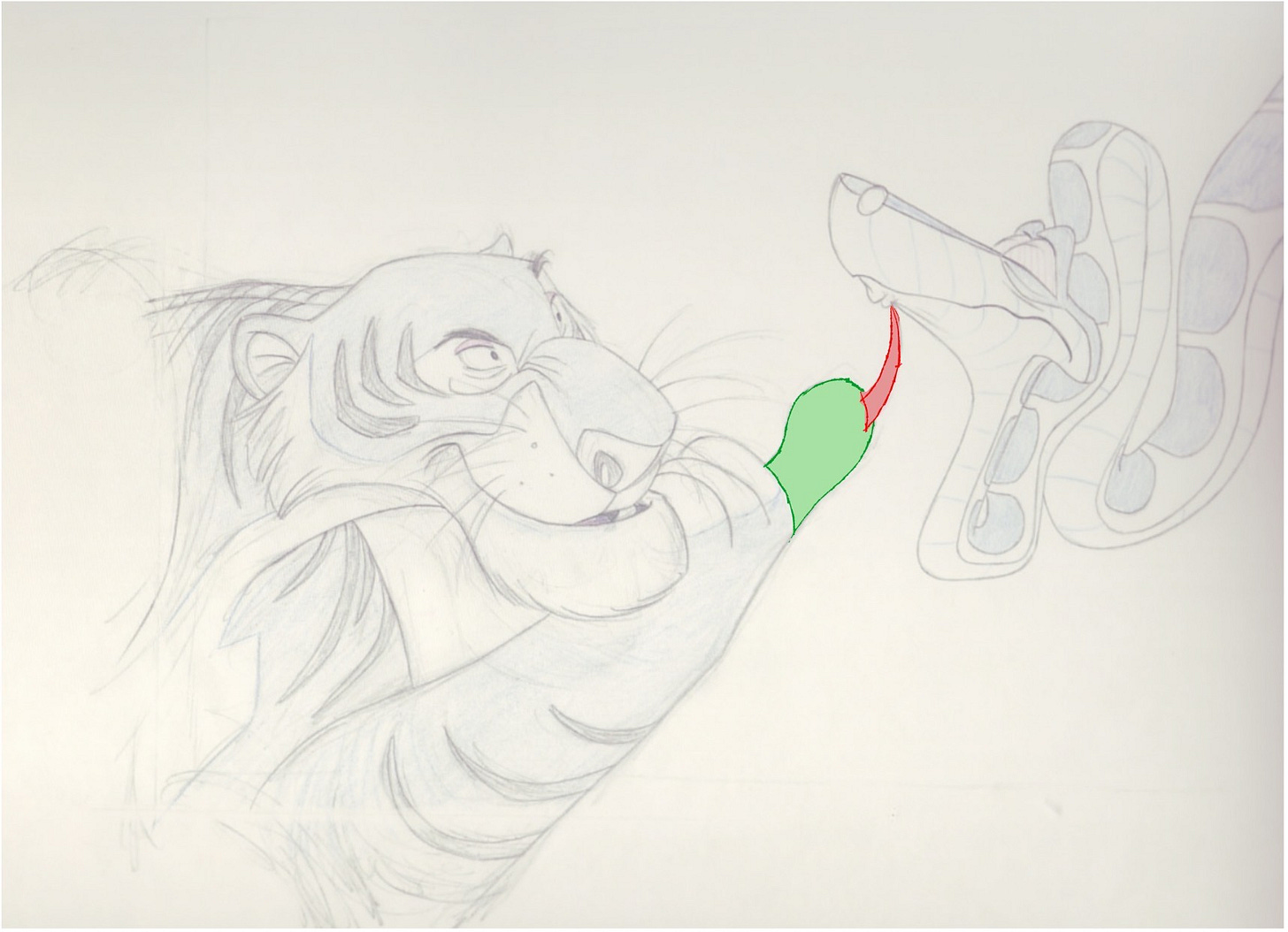
The most obvious place to start is the focal point of the composition. We can observe what was exaggerated from the original story sketch is the shape quality of the claw in contrast to the fleshiness of the finger. It's the contrast between the two different shapes/volumes qualities that we can viscerally feel them more profoundly then if they looked more similar.
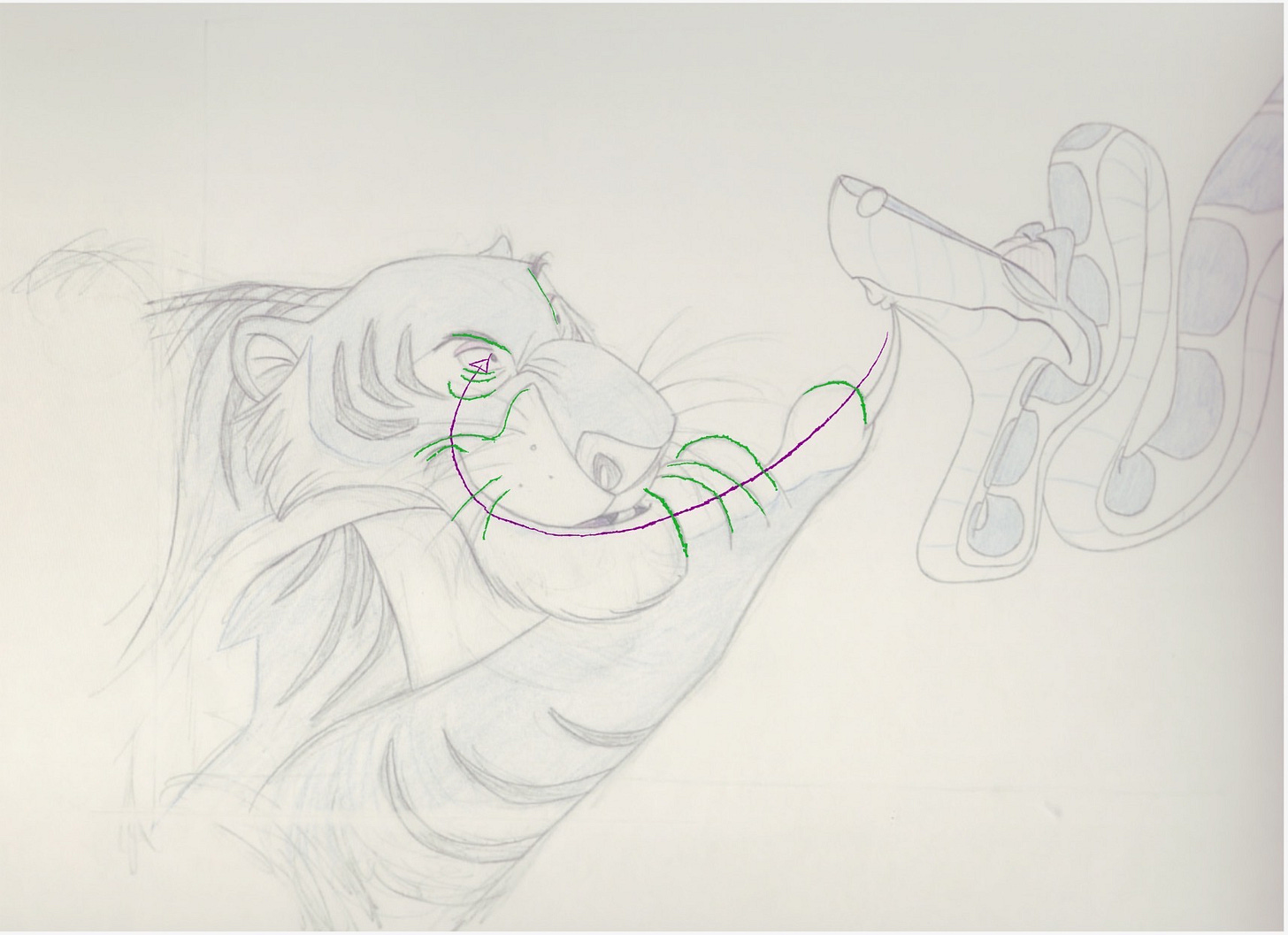
Now observe how Milt has pulled the fingers back and spotlighted the one finger with the claw more clearly. The fingers are not only pulled back but their is an implied gestural line that goes across the fingers and sweeps your eyes to his smile. Sneaky but excellent choice! You can flip from the original story sketch to see the effectiveness of this particular choice for posing..
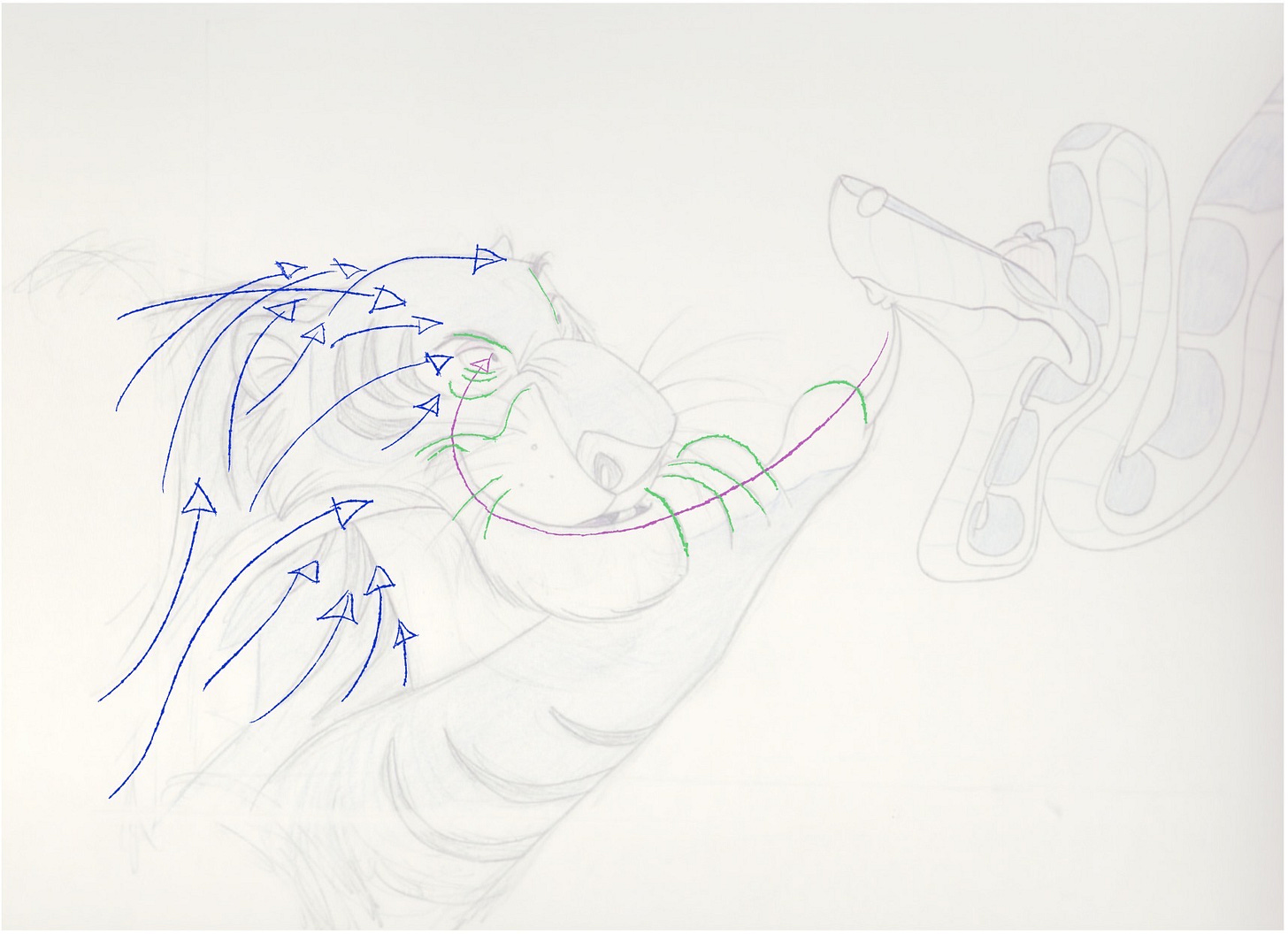
Now following the curve of the smile- there is another implied invisible gestural line that passes through to the cheeks and into his actual eyes. Observe how the cheeks aren't simply a demonstration of anatomy but the way that it's articulated through line it also gives an impression of graphic energy passing through from the sweep of the mouth line to his cheeks. The eyebrows are also wonderfully designed to flow them back to the pupils and the eyes again.
This should be enough for you to look where Kahn is looking at but the flow from his tiger stripes, the hair on the sides of his cheek, the pose itself and the white stripe for his neck are reinforcing a tidal wave of energy in the same direction. Again you can see the effectiveness of the arrangement of shapes to push towards the eye direction by comparing it with the absence of it.
Stepping another level back, observe the different choices of head angles between the two compositions. They are almost complete opposite versions of each other. In relationship to the claw underneath Kaa's jaw, I prefer Kaa's head slightly more profile in order to clearly and viscerally feel the moment then the 3/4 down angle from the story sketch. The advantage is to dramatize the silhouette line underneath his mouth. Rather then just an even s curve we get a specific type of curve that sits under the claw and the active energy of the straight trying to edge away from it. No longer are they simply straights va curves but these straights and curves have a part to play in the narrative. These graphic elements become actors!
The fear is enhanced by the specific way that Kaa's neck is tensed up. These curves in his neck/body aren't used to communicate relaxation- it's to embody someone being pushed against the wall.
Now look at the contrast between the silhouette line underneath Kaa's jaw and the line of his mouth doing everything it can do to push away from that claw. Again, it's the contrast between the bottom silhouette and the specific mouth line that enhances both their qualities to viscerally pull us into this moment. Now juxtapose that with the rigid top silhouette line pointing straight at the eyes- almost like someone point a spear at someone who is corners! The right juxtaposition of different layers of contrast can give you a layered impact of several movements- much like classical music!
This is one of many many poses but with Milt's work you can see that he saw a lot of value in milking even just one. He probably would not have even gotten this far without the amazing story sketches from Bill Peet as well. But here is an excellent example to see the master find what to exaggerate and what to simplify.


The Nine Old Men were the backbone of Disney's animated features from the 1930s to the 1970s- much of what is good about them all is the art they did.
Great analysis! But in the first paragraph you say the first drawing is Peet's and the second drawing is Kahl's. Isn't it the other way around?